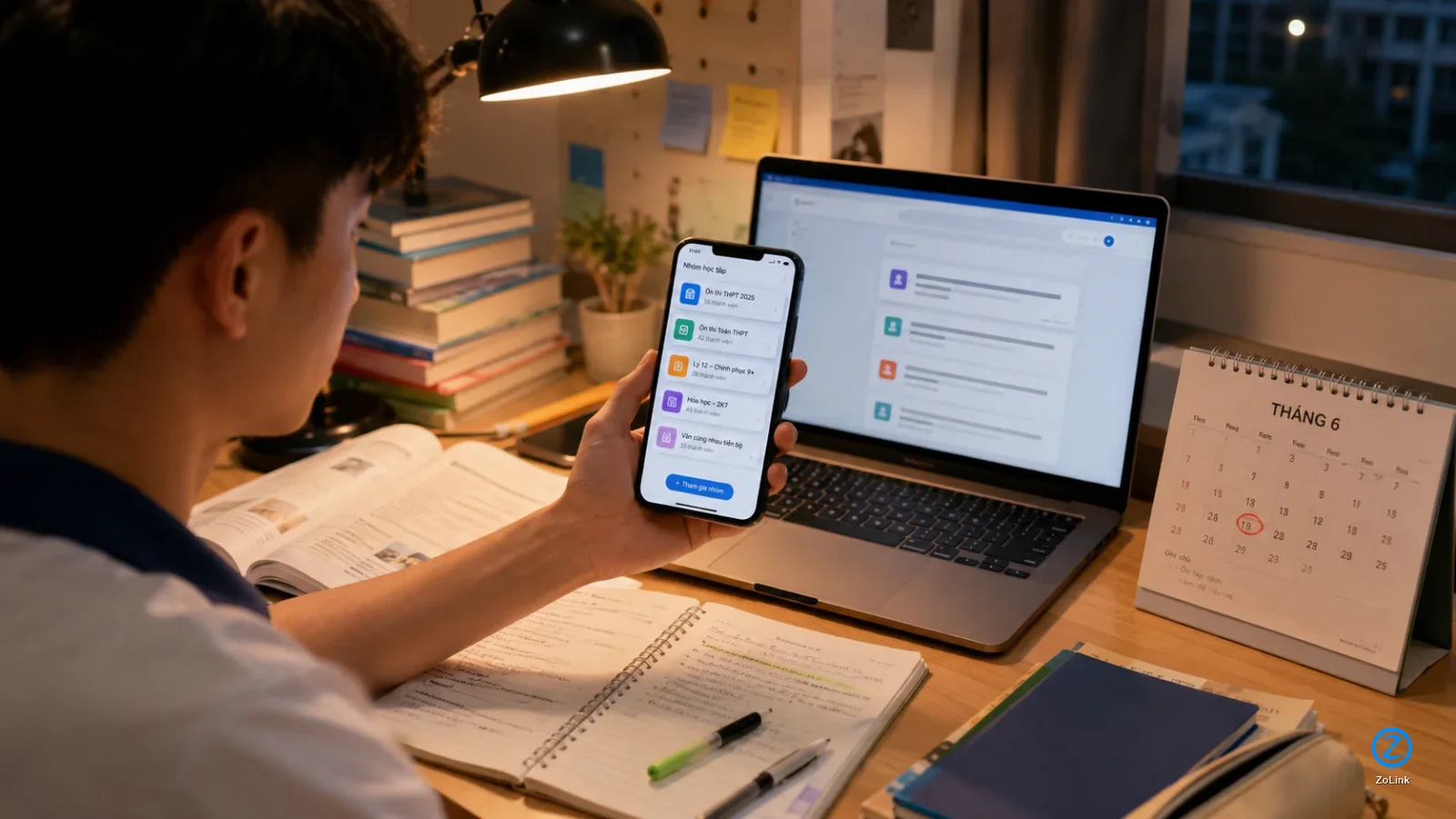
Why hard-to-remember Zalo OA links become a problem when shared with customers
Many Zalo Official Accounts and Mini Apps use default links made up mostly of numbers, such as zalo.me/1234553679280354321 or zalo.me/s/12349955691594321. Technically, these links still work. When customers tap them, they can still be taken to the right OA, Mini App, or Zalo destination.
The problem is the experience before the click. A long string of numbers does not tell customers which shop, service, or brand they are about to open. When a sales rep sends that link in a chat, a livestream comment, a poster, or a customer support message, a numeric link can feel dry, forgettable, and disconnected from the brand.
- Customers may find it hard to tell whether the link is real, relevant, or mistakenly sent.
- Sales and support staff may struggle to read, type, or resend the link quickly.
- The brand name does not appear in the URL.
- The link looks less polished when used in bios, QR codes, flyers, price lists, or message templates.
A numeric Zalo OA link may not be very long, but it is hard to recognize
Some shop owners assume that a numeric Zalo OA link is short enough and does not need to be changed. In practice, length is only one part of the issue. What customers notice first is not the number of characters, but whether the link makes sense.
For example, when someone sees a link like zalo.me/1234553679280354321, they have almost no idea whether it leads to a fashion store, a spa, an English center, or a warranty support channel. By contrast, a readable link such as zolink.vn/shop-thoi-trang, zolink.vn/oa-my-pham, or zolink.vn/dat-lich-spa gives customers immediate context: the link has a clear purpose, a recognizable meaning, and a more professional appearance.
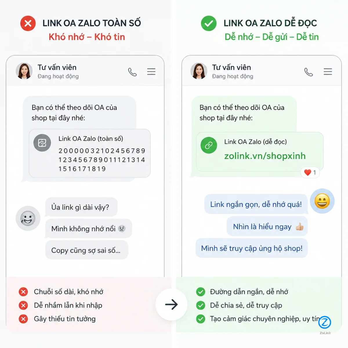
- Numeric links are fine for systems to process, but they are not friendly for human readers.
- A text-based link helps customers guess the destination before they click.
- Readable links support branding, sales conversations, and customer care more effectively.
Zalo Mini App links with /s/ can also confuse customers
Zalo Mini Apps often have their own link format, and many include zalo.me/s/ followed by a numeric string. For technical users, this is simply a normal URL structure. For everyday customers, however, the /s/ segment and the numbers after it do not explain much.
If you use a Mini App link to let customers book an appointment, view a menu, claim a voucher, request consultation, track an order, or join a membership program, the clearer the URL is, the better. A link such as zolink.vn/dat-lich-spa or zolink.vn/voucher-my-pham is usually easier to understand than a context-free string of numbers.
- Customers should not need to understand what a Mini App is before clicking the link.
- The URL should reflect the main action: book, claim, view, register, or track.
- The easier the link is to understand, the easier it is for staff to use in sales scripts.
When should you turn an OA or Mini App link into a readable URL?
Not every Zalo link needs to be changed immediately. If you only use a link internally within a small team, do not send it to customers, and do not place it on sales materials, the default link may be good enough. But once the link starts appearing in front of customers, it is worth considering a more readable version.
The first groups that should make the switch are online shop owners, sales teams, spas, clinics, education centers, small businesses, Zalo OA managers, and Mini App operators using Zalo for customer journeys. In these cases, the link is not just a technical shortcut. It is part of the conversion path.
- You often send OA links to customers through Zalo, Messenger, SMS, or email.
- You place the link in social media bios, QR codes, posters, business cards, or landing pages.
- You manage multiple OAs, Mini Apps, Zalo groups, or communities that need to be clearly separated.
- You want your staff to use one consistent, readable link and reduce the chance of sending the wrong one.
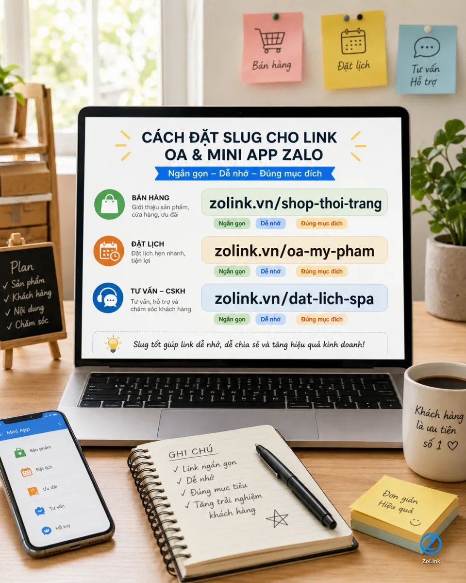
How to create a readable link: keep it short, clear, and not overloaded with keywords
A readable link does not need to pack in the full industry name, product category, location, and every possible sales keyword. A good link is one that customers can scan quickly, remember easily, and understand correctly. Prioritize a short, non-accented slug, using hyphens where words need to be separated.
For example, a cosmetics shop can use zolink.vn/oa-my-pham instead of a long slug like zolink.vn/kenh-oa-ban-my-pham-chinh-hang-gia-tot. A spa can use zolink.vn/dat-lich-spa if the main goal is to send customers to a booking Mini App. A teacher can use zolink.vn/lop-tieng-anh to direct learners to the right consultation channel.
- Aim for 2 to 4 short, easy-to-read words.
- Use the brand name, business category, or main customer action.
- Avoid hard-to-type characters, unclear abbreviations, or overly long slugs.
- Do not keep changing the slug if the link has already been printed on posters, QR codes, or sales materials.
Practical examples for shops, service providers, teachers, and small businesses
For online shops, readable links help staff send the right destination faster during sales conversations. Instead of pasting a numeric string that customers cannot recognize, you can use purpose-based links such as zolink.vn/shop-thoi-trang, zolink.vn/oa-my-pham, or zolink.vn/san-pham-moi. Customers can immediately see that the link is related to the shop or product they are asking about.
For spas, clinics, salons, service centers, or teachers, a readable Mini App link can be tied directly to the customer action: booking an appointment, requesting advice, viewing a price list, or signing up for a trial class. This is especially useful when your link appears across multiple touchpoints: chat messages, counter QR codes, Facebook posts, TikTok bios, livestreams, and printed materials.
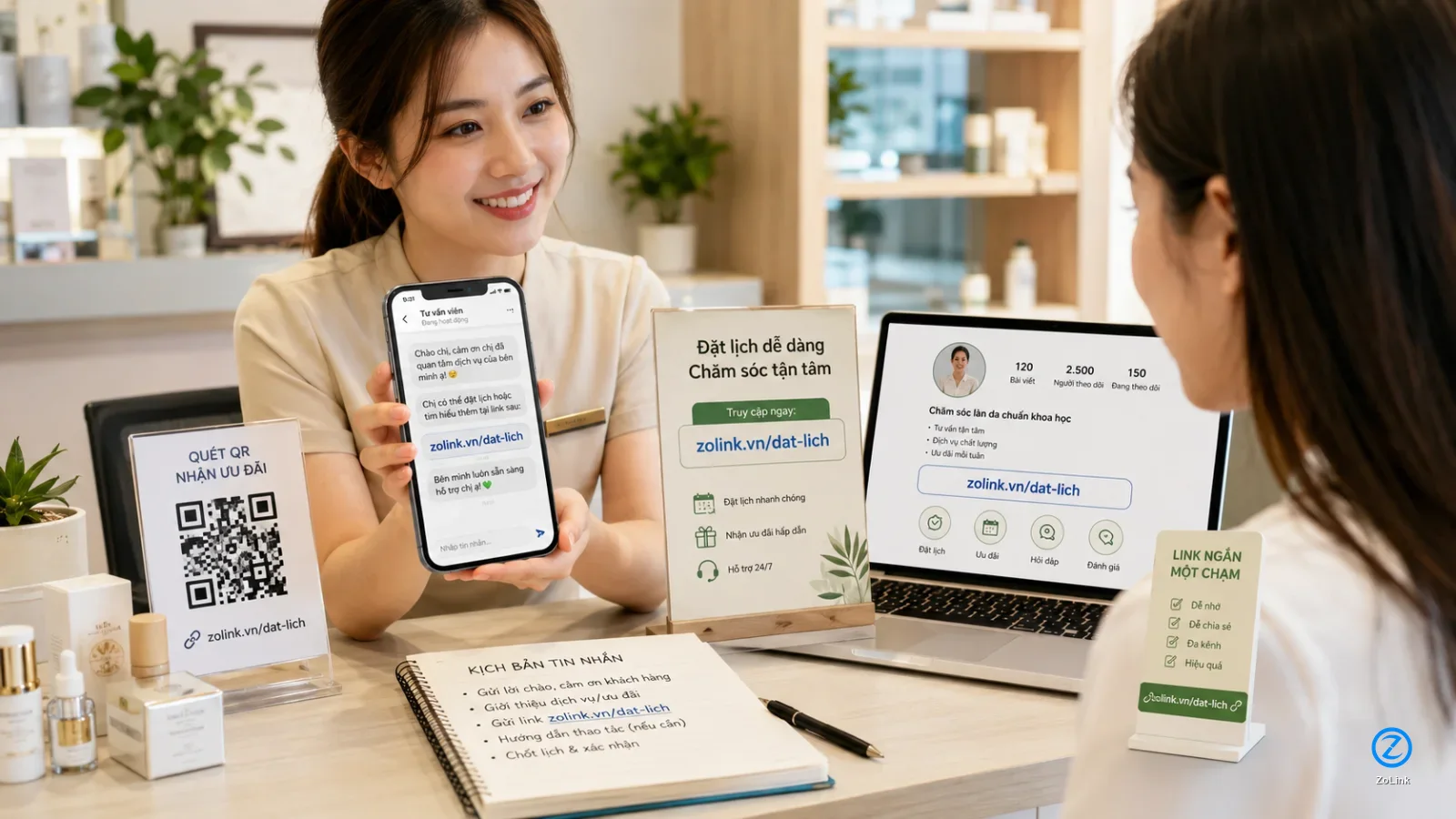
- Fashion shops: use a short link to guide customers to an OA consultation channel or product category.
- Spas, salons, and clinics: use action-focused links for booking or claiming offers.
- Teachers and education centers: use links for classes, consultation groups, or registration flows.
- Small businesses: use one consistent link across sales and customer support teams.
Changing the link is not only about appearance; it reduces friction before customers act
In Zalo-based sales, customers rarely spend time analyzing a URL. They simply need the link to feel clear, relevant, and trustworthy enough to click. A numeric link may not directly drive customers away, but it adds an unnecessary layer of hesitation.
A readable link removes that friction. When a customer is asking for a price, booking a service, claiming a discount, or opening a Mini App, a meaningful URL makes the transition smoother. It is a small detail, but it can matter in industries where teams send links to customers many times a day.
- Customers understand more quickly what the link is for.
- Sales staff can send the link with more confidence and consistency.
- The brand appears naturally inside the URL.
- The same link can be reused across channels without long explanations.
Should you use shortened links for OA and Mini App destinations?
Yes, as long as the shortened link is still meaningful, stable, and points to the correct destination. What you should avoid is using links that are too generic, hard to interpret, or unrelated to your brand. A short but meaningless link does not solve the recognition problem.
For Zalo destinations such as Official Accounts, Mini Apps, Zalo groups, or community channels, you can use ZoLink’s link submission tool to create a more readable path for customers. When you need to discover more communities or related Zalo destinations, ZoLink search can also be useful for reference.
- Choose a short link that still carries meaning.
- Always test the destination carefully before using the link in a campaign.
- Use one main link for each OA, Mini App, or consultation goal.
- Avoid using too many different links for the same destination if your sales team may get confused.
Checklist before sending an OA or Mini App link to customers
Before adding a link to a message template, QR code, social bio, or sales material, run through a few basic checks. The goal is to make sure customers land in the right place, understand the purpose of the link, and do not hesitate because the URL looks unfamiliar.
This checklist is especially useful if several staff members use the same links, if multiple campaigns are running at once, or if you manage several Zalo destinations such as OAs, Mini Apps, community groups, and customer support channels.
- Is the link easy to read inside a chat message?
- Is the slug related to the brand, business category, or main action?
- Can customers guess what the link is about before clicking?
- Has the link been tested on a mobile phone?
- Is the link stable enough to use on posters, QR codes, bios, and sales scripts?
Conclusion: readable links are a small detail worth fixing early
A hard-to-remember Zalo OA link or numeric Mini App link is not a critical error, but it is an easy improvement if you often send links to customers. When the URL is easier to read, customers understand it faster, staff can share it more confidently, and your brand becomes clearer in every conversation.
If you use Zalo OA, Mini Apps, or other Zalo destinations for sales, consultation, customer support, bookings, or community building, start with a short and meaningful slug, then use it consistently. A link like zolink.vn/dat-lich-spa or zolink.vn/oa-my-pham is far easier to work with than a numeric string that nobody remembers.
- Do not just shorten the link; make it understandable.
- Do not make the slug too long; choose words that matter to customers.
- Do not use scattered links; keep one main link for each destination.